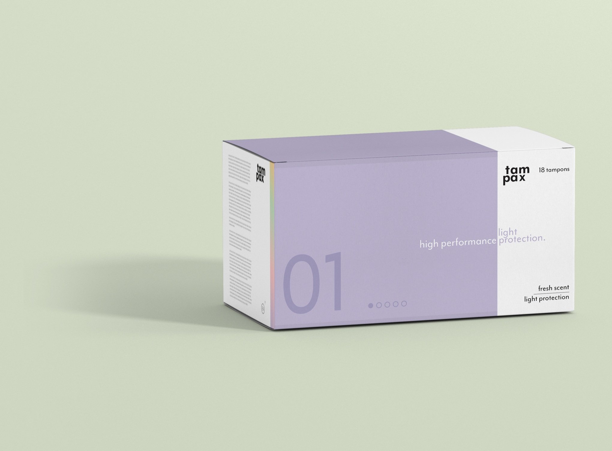
Tampax Rebrand
Beauty and Cosmetics
art direction // packaging design // branding design // copywriting // social media design
Tampax is one of the most recognizable feminine care brands and a staple in the homes of millions of women worldwide. However, in its current state, the existing packaging is a box that is meant to be hidden inside of a cabinet rather than set on a countertop.
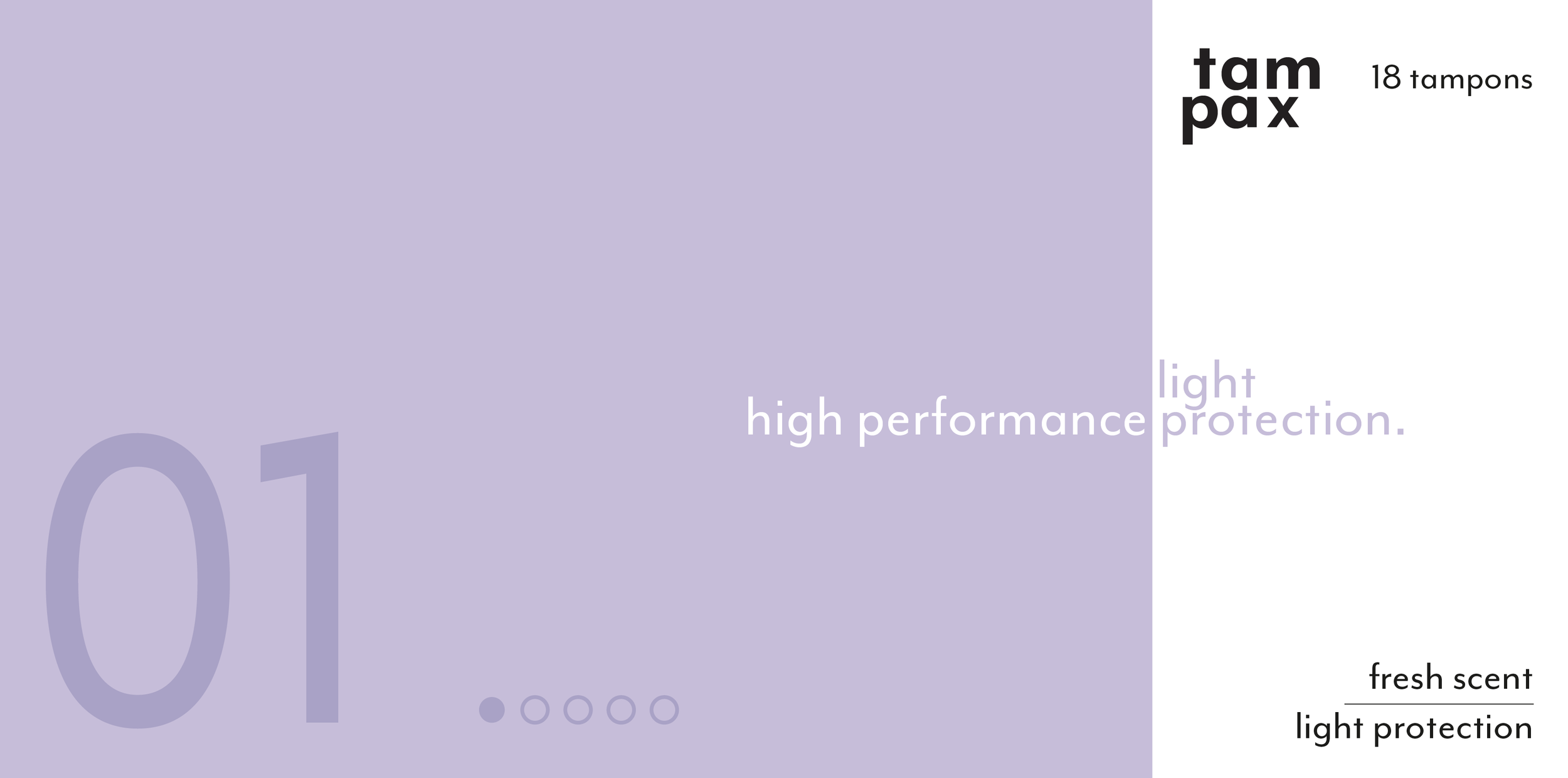
To refresh the existing design, I began by reformatting the logo to a stacked design and modernizing the current typeface. I also simplified the secondary packaging – utilizing the same set of identifying colors as the current boxes and incorporating both a number and dot system to represent the protection level of the product. With three methods of product navigation being present on pack, the shopping experience becomes intentionally simpler for customers in-store.


I created an accompanying set of business cards for employees, as well as an introductory social media post (Instagram story) to announce the launch of the new and refreshed look.